
Project Info
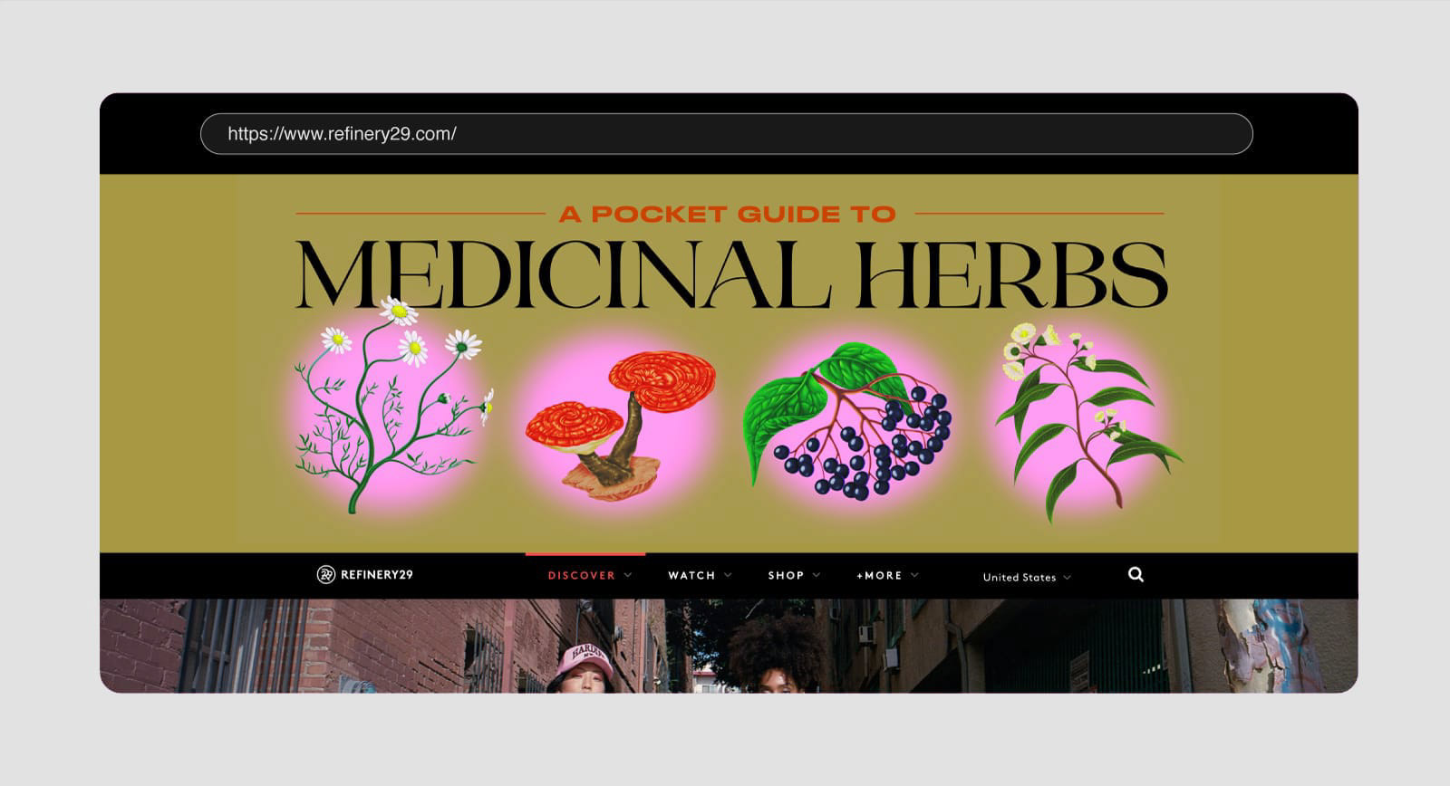
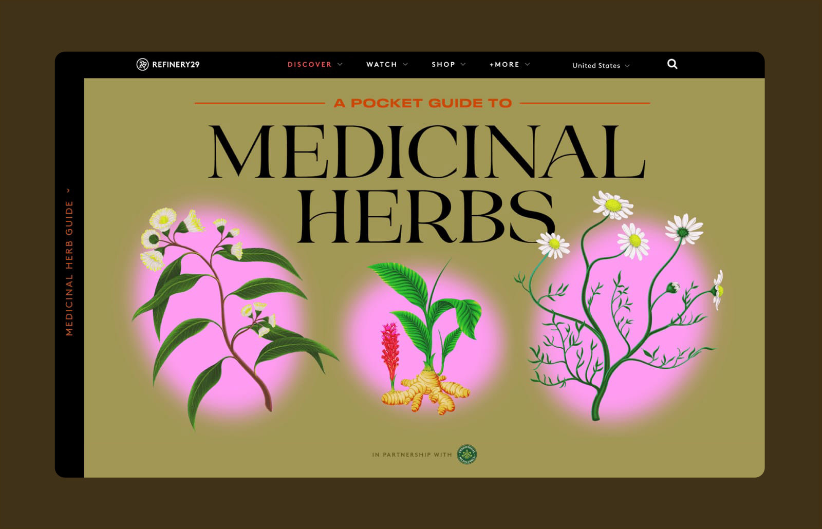
Sponsored by Traditional Medicinals, this interactive microsite takes readers through an informative journey to learn about 29 different medicinal herbs and their health properties.
Inspired by Farmers' Almanacs and vintage field guidebooks from the '70s, I developed a visual identity that juxtaposed these encyclopedic vibes with a mix of bold modernity. Check out the full experience on Refinery29.com here.
_______
Role: Art Director, Designer (Brand Design, UX/UI)
Lifestyles Editor: Eliza Dumais
Illustrator: River Cousin
Web Developer: Lee Misenheimer
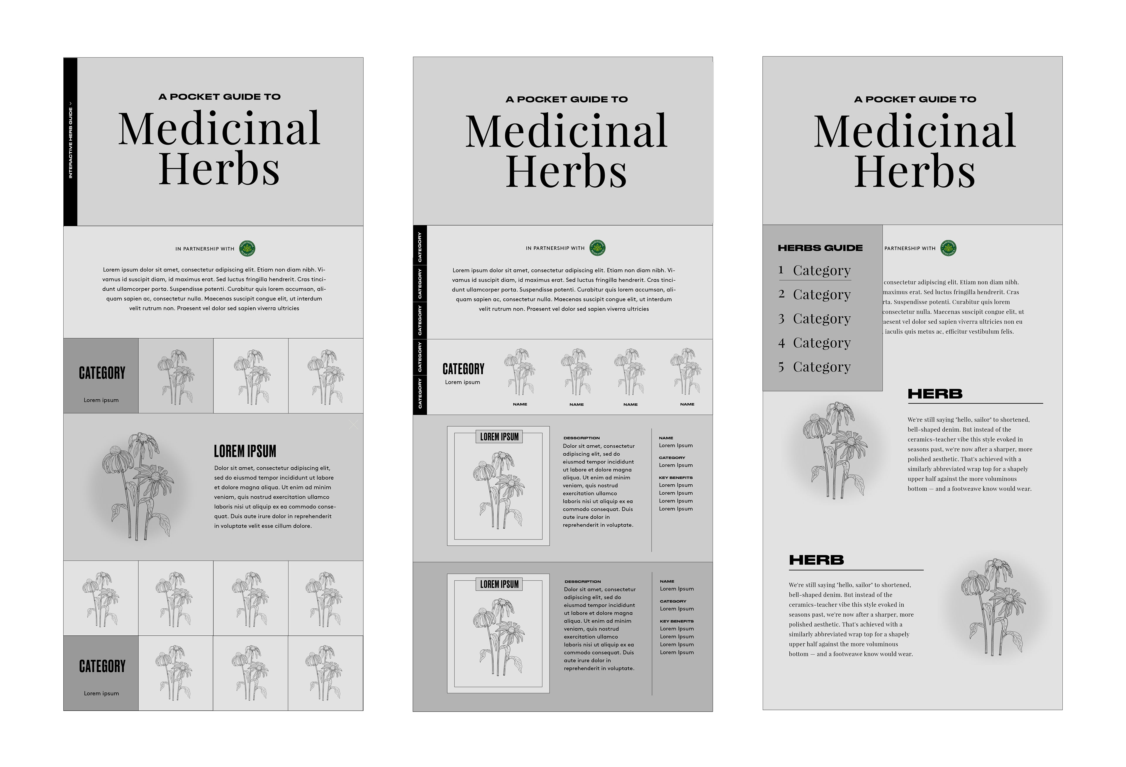
Initial Wireframes
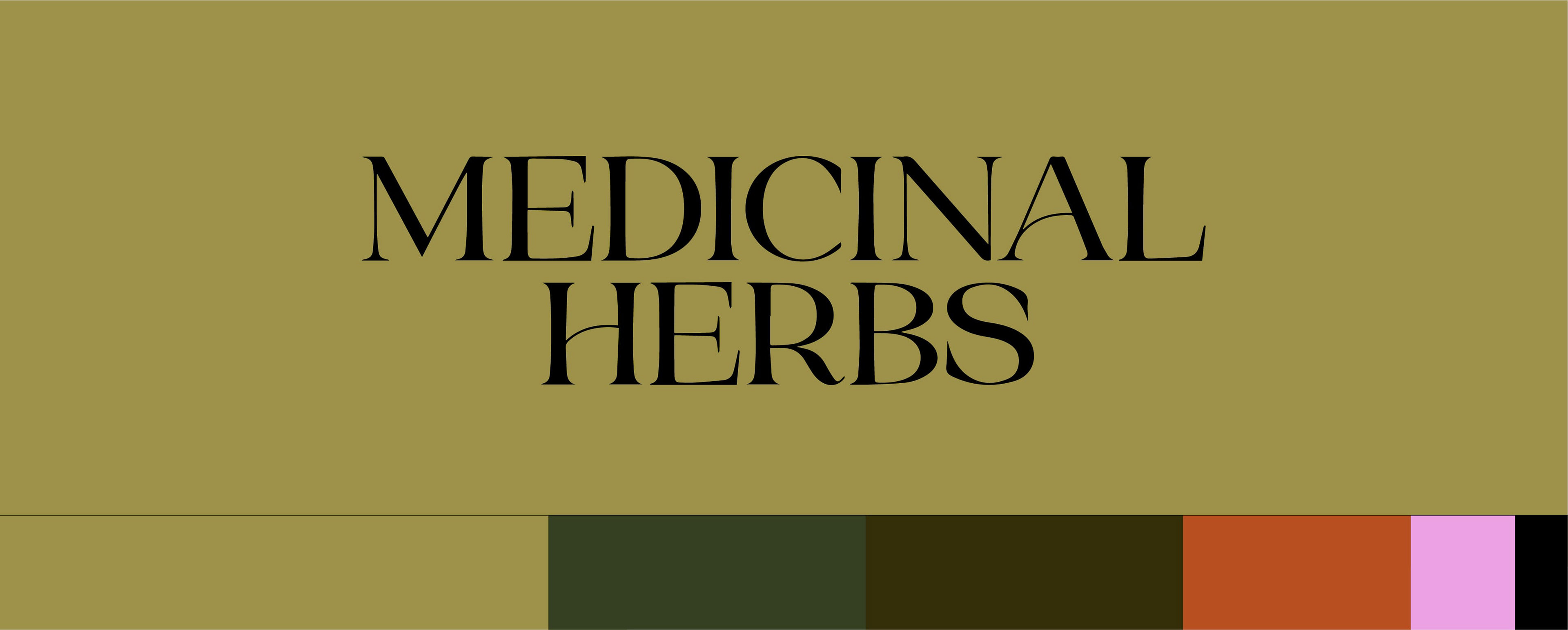
Typography & Palette
Outside R29's company fonts, I introduced a new typeface — Aequitas to this project, which brought in an encyclopedic aesthetic while adding an element of playfulness that compliments the organic curves of the illustrations.
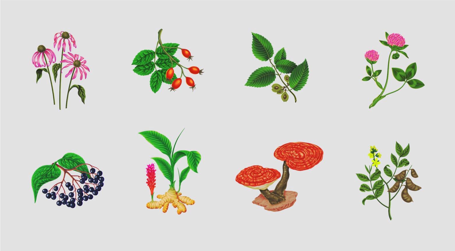
Illustration
I brought on illustrator, River Cousin, who has an incredible hyper-realism meets surrealism aesthetic that was perfect for this feature.
Neon yellow is used as an unconventional highlight colour, which brought a new sense of life and helped these illustrations look vibrant on three background colours: dark green (nocturnal), golden tan (the light) and pale pink.
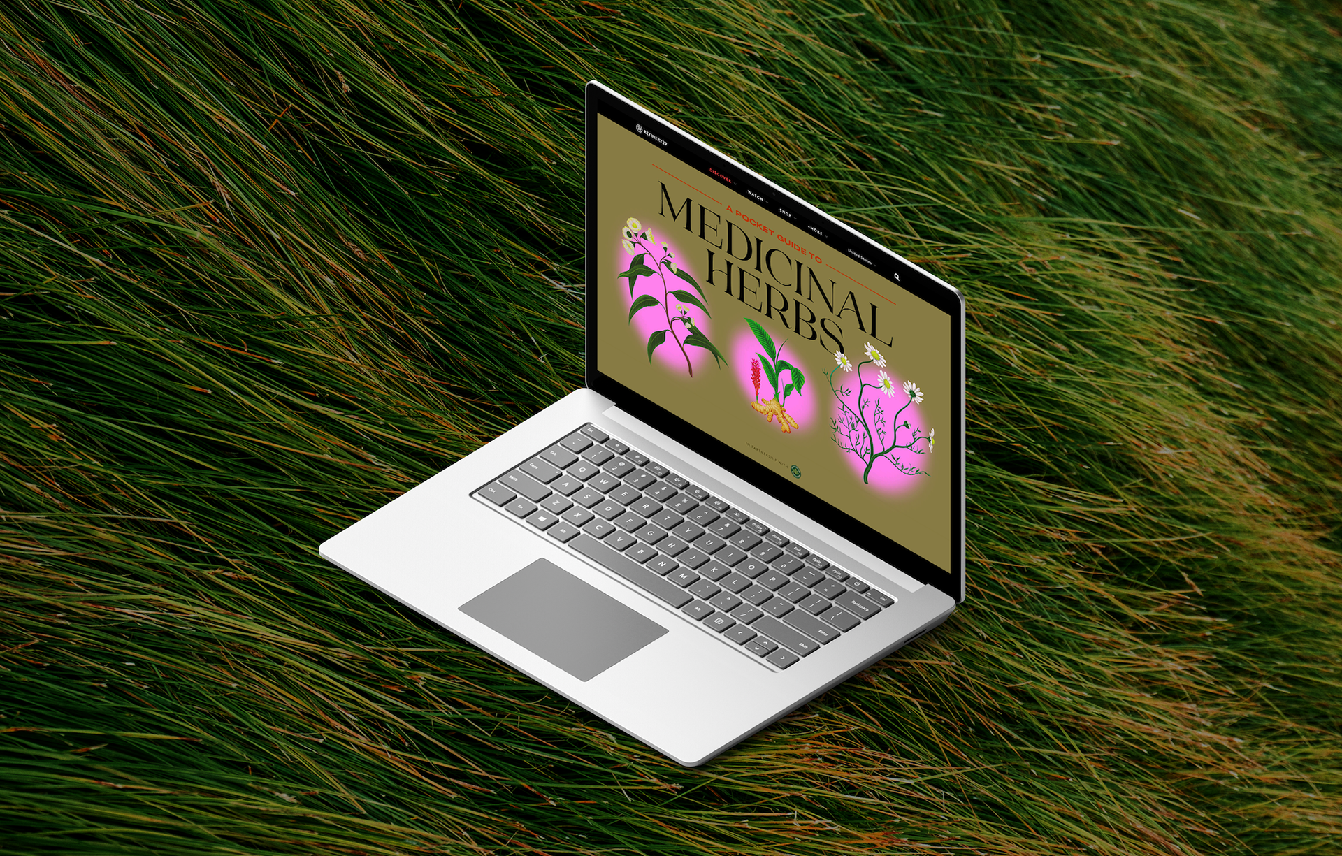
Interactive Microsite
By varying the sizes of the grids on the microsite, opportunities were provided for some of these herbs to be prominently featured. Here is the final microsite for desktop and mobile. Check it out live on Refinery29 here.
Interactive Features
A hover effect on the tiles creates an illumination effect — bringing the herbs from darkness to life. For the pop-up cards, I used a combination of sienna and hot pink to create an unexpected surprise. The side navigation bar expands to an herbs list for quick reference.

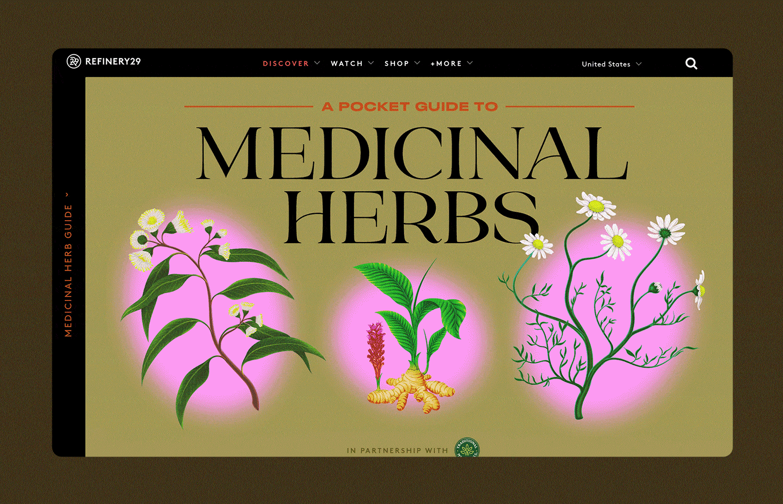
Refinery29 Homepage Takeover
To promote the microsite, I also designed a series of banners that appeared across Refinery29.com, including on the homepage.